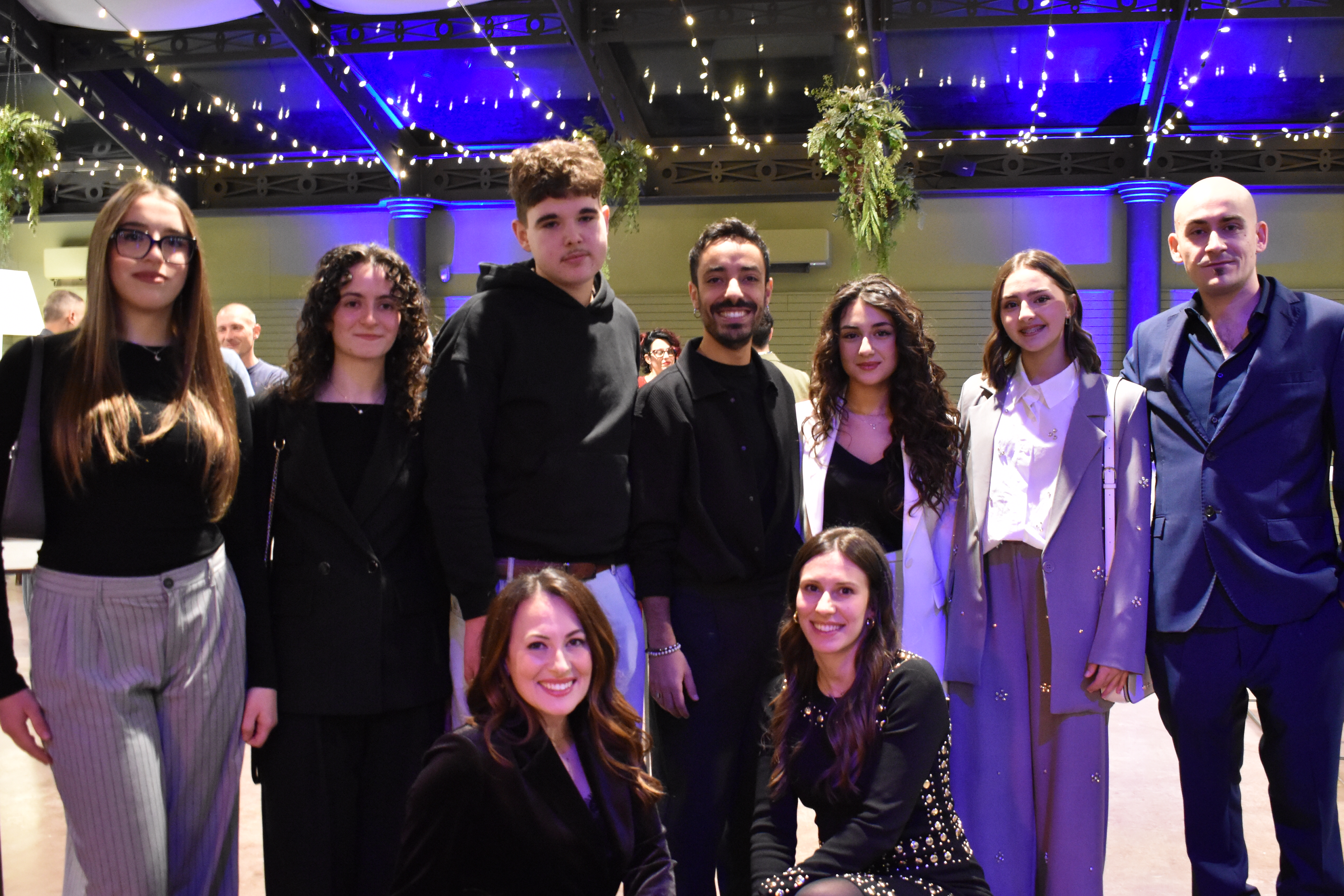
Etichettala 2025 was much more than a creative competition: it was a genuine meeting point between business and new generations.
Born from the collaboration between LA COMMERCIALE SRL and the Art Institute of Alba, the project involved over 70 fourth- and fifth-year students, offering them the opportunity to engage with a concrete, real-world professional challenge.
The initiative allowed us to connect with young people from the Alba area, to listen to their visual language, and to highlight their ability to interpret the world of wine labels with fresh, creative, and contemporary perspectives.
The Selected Labels
Among the many submissions received, the jury identified a shortlist of particularly noteworthy labels, distinguished by originality, graphic refinement, and strong communicative impact.
The selected labels were designed by:
- Lia Anna Racca
- Lorena Camera
- Annasofia Cavallo
- Alexandru Concieaga
These projects interpreted the brief with sensitivity and personality, demonstrating the level of talent and design awareness already present among the young creatives of our territory.
First Place
The winner of Etichettala 2025 was Francesca Pionzo, whose label impressed the jury for its balance between aesthetics, concept, and communication. A project that stands out for its expressive maturity and clear design vision, confirming both the educational value of the experience and the strong potential of the new generations.
Looking to the Future
For LA COMMERCIALE SRL, Etichettala 2025 represents an important step in strengthening dialogue with schools and artistic education. A forward-looking project that invests in creativity, local talent, and young designers, with the hope that this experience marks only the beginning of new collaborations.
📸 Below, we present a selection of the winning labels, each accompanied by a brief commentary describing the concept, stylistic choices, and key design strengths.
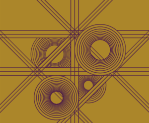
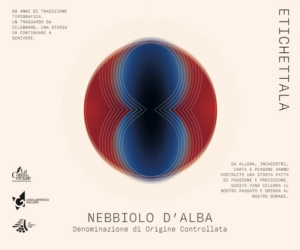
Alexandru Concieaga / Student’s words:
“I drew inspiration from the geometric shapes typical of LA COMMERCIALE’s graphic identity. The four circles represent the company’s 80 years of celebration.”
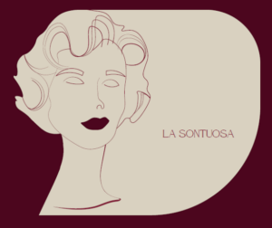
Annasofia Cavallo – “La Sontuosa”/Student’s words:
“La Sontuosa was created from the desire to express character, elegance, and luxury. The name evokes depth, charm, and intensity—qualities that represent Mrs. Luciana.”
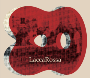
Lia Anna Racca – “Lacca Rossa” / Student’s words:
“The label is created by overlaying the image of the old printing house with a red shape that recalls the 80th anniversary. A touch of vintage elegance.”
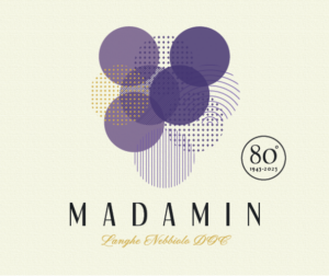
Loredana Camera – “Madamin” / Student’s words:
“The choice of the name Madamin refers to the figure of the Piedmontese married woman—elegant and refined, yet still dynamic and youthful. The perfect representation of a Nebbiolo.”
Francesca Pionzo (1st Place) /
Student’s words: “A simple idea at its core: simplicity and quality. The elements are few and essential, with the company anniversary at the center. A play of vibrant colors.”